In this tutorial, I will show you how to add an Average Line in Power BI graph.
Step 1: Insert Student Information Excel data source to Power BI dashboard.
Step 2: Have the following graph in Power BI dashboard. If you don't know how to do this - please follow this beginner tutorial.
Step 3: This graph should be a Visualization type of "Clustered Column Chart"
Step 4: Select "Analytics"
Step 5: Add Average Line
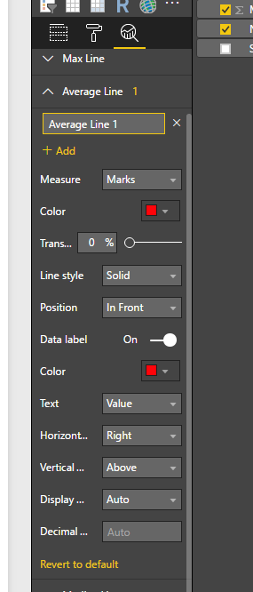
Step 6: Set the following properties
Here is your output - In the same way, you can add a Median, Percentage, Max, Min lines as well to any Power BI graph.
Step 1: Insert Student Information Excel data source to Power BI dashboard.
Step 2: Have the following graph in Power BI dashboard. If you don't know how to do this - please follow this beginner tutorial.
Step 3: This graph should be a Visualization type of "Clustered Column Chart"
Step 5: Add Average Line
Step 6: Set the following properties
Here is your output - In the same way, you can add a Median, Percentage, Max, Min lines as well to any Power BI graph.


Thanks :D !!!!!
ReplyDeleteI was trying with measures but the value was self-calculated, which makes sense but it was not what I wanted.
Nice reading, This is an informative information, thanks for sharing this blog.
ReplyDeletePower Bi Training in Bangalore
Thank you so much for providing information about Power BI and those aspects that can easily look and find out how mathematical calculations and averages can be solved and alternated.
ReplyDeletePowerbi Read Rest
business analyst online training
ReplyDeletepower bi training institute
tableau training
hyperion online training